Introducing 'minimaJake', a minima theme fork for Jekyll with years of improvements & design changes!
Over the last few years I’ve slowly added functionality to the default Jekyll “minima” theme, and recently made it all publicly available. Here’s a description of & integration details for all the new features minimaJake offers, from comments to Ko-fi support to accent colouring!
Note that this post is reposted entirely from https://blog.jakelee.co.uk/introducing-minimajake-for-jekyll/.
How to use minimaJake
If you’re interested in using the theme after seeing all the additions, the easiest way is to just copy this blog’s _config.yml, updating the name / accent colour etc as desired.
As I write this post the latest version is v1.0.1 (so the import would be remote_theme: JakeSteam/minimaJake@1.0.1), but check the releases page for any updates.
Native features
Table of contents
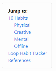
A table of contents is automatically generated for each post, and uses jekyll-toc.
All headers (h1 - h6) currently generate a link, but this can be customised by overriding post.html. The table of contents’ width is based on the header length, so it’s a good idea to avoid very long headers (although this is good advice anyway!).
The “Jump to:” text can be changed in the _config.yml, if it is removed completely then the table of contents will be disabled. The table of contents uses the accent colour for its border, here’s an example from my grey-accented personal site:
Linkable headers
Mousing over each header will make a small link icon appear. This can be used to link directly to any point of the post, and is very powerful when combined with the table of contents. I’m using the Javascriptless jekyll-anchor-headings.
Some extra liquid and CSS has been added to provide properly aligned GitHub style anchor links.
Tag system
Every post on all of my sites has “tags” AKA topics. These don’t have any strict rules, but I use them to roughly group posts, and make searching for related posts a bit easier. You could also use them for calculating most closely related posts, but minimaJake doesn’t currently.
They are defined within the front matter of each post very simply:
tags:
    - Minima
    - Jekyll
    - Liquid
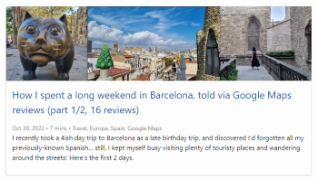
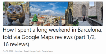
The tags.html script is included in the homepage post preview & main post header, and just loops through each tag linking to the search page for that term. The examples below are from my post about a Barcelona trip:
| Homepage | Post |
|---|---|
 |
 |
Reading time
You might have also noticed the “reading time” in the above screenshots. This is a super simple script called read_time.html that essentially just divides the number of words by 150, and assumes the article will take that many minutes to read.
This obviously isn’t very accurate, as some very technical articles might take hours to properly follow, whereas others are simple enough to be skim-read. However, it’s a nice indicator of approximate article length.
Pagination
The “pagination” at the bottom of the home screen (most visible on sites like https://blog.jakelee.co.uk) uses more complex pagination than Jekyll’s default. By default it just creates a link to each page, but this looks pretty bad with more than 3-4 pages. minimaJake’s pagination shows the surrounding few pages, and the first / last. The code is in paginator.html.
I’m having a little trouble finding where exactly the version I use is taken from, but it is somewhere in this tutorial by “Epsi”. The below gif is also from their site, mine currently has no CSS:
End of post CTA
The bottom of every post contains a CTA (call-to-action) encouraging readers to subscribe to my weekly newsletter. This is just a block of HTML in the config, where removing the line entirely will also hide the CTA.
Social & meta link system
Whilst I recently wrote a detailed guide to adding links to minima’s social link system, I actually use a modified version for my sites.
By default, minima supports a list of clickable buttons at the bottom of the page. This is OK, but I wanted a column of “meta” links (email, repo, RSS) inside the footer. Currently, here’s how it works:
- Social links are defined in
_config.yml, with the presence ofuser_titledetermining where the link should appear:
# No user_title set, will appear at bottom:
- { platform: twitter, user_url: "https://www.twitter.com/JakeLeeUK" }

# user_title is set, will be shown in meta column:
- {
    platform: email,
    user_url: "mailto:[email protected]",
    user_title: "[email protected]",
  }
- Every page includes the footer, and the footer includes
social.htmlandmeta.html. - These are identical, except
social.htmlcreates asocial-item.htmlfor each social link, whilstmeta.htmlcreates ameta-item.htmlfor each meta link.
I have 4 links in each, creating these two blocks of links:
| Meta links | Social links |
|---|---|
 |
 |
Third party integrations
lunr.js search
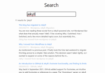
Whilst minimaJake does include a search script, a search.md page is needed to surface this functionality (e.g. this site’s search page).
This search.html script can be very slow to load (but provides almost instant responses), hence why it isn’t included in every page. It very hackily loads every single post into a Javascript variable, then searches through those for your term! It uses lunr.js, with some extra styling & Javascript on top.
One additional feature is the ability to link to a specific term (example), this just simulates a search action if the URL parameter is set.
Eventually I’d like to export the text from all posts to a static file during compilation / publishing, then just use this for future lookups instead of essentially regenerating this data every time the page is loaded.
Giscus comments
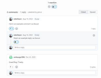
I’ve written about Giscus before, and a full setup tutorial is included there.
In minimaJake all the variables are set in the _config.yml, and if they are removed from the config the comments functionality will be disabled.
Ko-fi donations
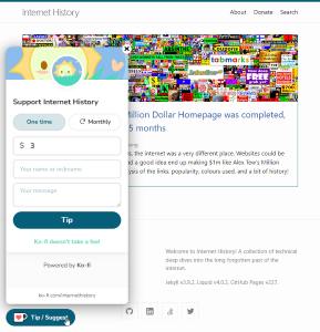
My internet history site uses Ko-fi for donations / commissions. Both floating & fixed buttons are used, and their text / Ko-fo target can of course be customised via _config.yml. As always, deleting them from the config will disable the feature.
The fixed button appears at the end of each post (after CTA, before Giscus comments), and can also be included manually anywhere with:
{%- include custom/donatebutton.html -%}
| Floating button | Fixed button |
|---|---|
 |
 |
Design changes
Banner images
Perhaps the most striking change when opening a minimaJake site vs a minima site is there are banner images for every post!
These are defined in a post’s front matter using image: https://blog.jakelee.co.uk/assets/images/2023/minimajake.png, then included on both on the homepage and the post itself. Clicking the image opens a full-size version of it.
I really, really like this functionality, and it was one of the first things I added. With the image, each post becomes more than just text, and I find even a simple screenshot of code instantly makes the most more appealing.
Banner images are rendered onscreen at 768px x 180px. Despite this, I recommend adding extra off-screen content to the top and bottom, making the image less rectangular, and also making the image larger than necessary and letting the browser scale it down. This will encourage social media sites to provide a rich preview, and make the post more appealing.
In the example below, a full-screen screenshot was used. This meant the image met Twitter’s recommended sizes, but was heavily cropped for the blog’s actual header:
| Actual image | Twitter preview | Blog preview |
|---|---|---|
 |
 |
 |
Accent colours
Finally, each site has its own “accent colour”, also defined in the _config.yml.
This is used for the borders around post “cards”, table of contents border, a strip at the top of the site, and mouseover colour for the footer links. Currently it is only used occasionally, but it helps give each site a distinct feel whilst still being minimalist and attractive:
Upcoming changes
Now that a shared theme is used across all my sites, it’s significantly easier to make improvements. Here’s a few of the planned improvements I’m hoping to work on soon, roughly in order of priority:
- Tidy up dark mode now that it is supported, e.g. adjusting Giscus theme to match.
- Use the accent colour more heavily, perhaps introducing the ability to have a different accent colour in dark mode.
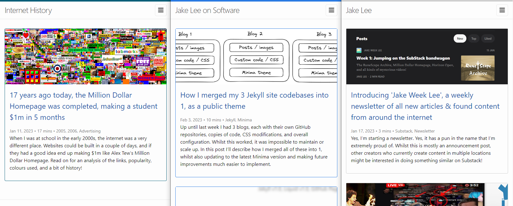
- Create a “site picker” bar, to show that all my sites are connected, and that there’s plenty of posts!
- Optimise search enough to include the functionality on every page in the header.
- Publicise / document the theme better. One option is to use the current showcase site to document updates to the theme, instead of cluttering this blog.
Conclusion
Overall I’m surprised how many things I’ve actually added to Minima over the years, each of them feels like such basic functionality that I forget they aren’t included!
Of course, adding functionality somewhat goes against what Minima is aiming to be: A default, no-frills theme. However, I believe minimaJake fills a crucial role: minimalist, whilst still having the option for advanced functionality.
If you use minimaJake or have any feature requests / issues please let me know, it’s very much a labour of love so I’m always looking to improve it!
